If you just read headlines, you’d think marketers flunk every time when it comes to package redesign.
Not true.
I’m happy to report that my favorite cereal brand, Arrowhead Mills, has done a nice job updating their healthy, grain-based line of cereals.
And by the way, not to get onto a related but different topic here, it’s not that hard to add healthy (fiber, whole grains, low added sugars) and good tasting cereals to your breakfast table.
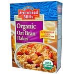
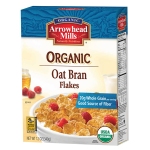
There weren’t any grievous issues with the old cereal packaging, but the use of a white background provides a contemporary, fresh and up-to-date feel.
Arrowhead Mills has wisely continued with the prominent front-panel, content benefit statements (e.g., whole grain, fiber, low fat). This is the right approach based on consumer learning from when I worked for global ingredient supplier Tate & Lyle.
Two other front panel changes were made that are minor and subtle. The word “Organic” is a bit more prominently featured via graphic treatment. (It’s not why I buy the cereals but probably helpful for establishing the product’s bona fides and signaling to those looking for organic.) And, the Whole Grains Council logo has been moved from a side panel to the bottom left front panel.
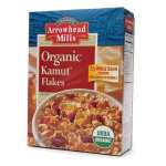
See for yourself in these before and after photos:


Arrowhead has also cleaned-up the back panel. It now has clearly titled sections about the company, the product and a new section featuring a short profile of an ingredient supplier partner (the people profiles rotate across the products). Gone are recipes and the photo/text listing of the cereal product lineup. Instead, shoppers are encouraged to visit the website. That makes sense. It’s easier for Arrowhead to keep the information current this way, which helps consumers.


By the way, I learned something new. I noticed that the words “khorasan wheat” were added in small font below the word Kamut on the front panel. It turns out that Kamut is a branded, registered trademark for khorasan wheat, held by an independent entity — another example of branded ingredient marketing.
The only quibble (tiny) I have is the removal of the specific product name from the top panel, replaced with a larger company logo. It was convenient to see the product name when stacking my pantry with multiple cereals.
Headline
Contrary to news reports the past few years, food and beverage package redesign isn’t always a fiasco. Arrowhead Mills shows us how to do it right with a makeover of its healthy cereal product range.
Harvey Chimoff is a hands-on marketing leader and business-wide collaborator who builds marketing capabilities in B2B/B2C organizations that drive customer success.

Leave a comment