There’s an old marketing adage: when a new brand manager arrives, get ready for a package design change.
While there may be some historical truth to that expression, its use typically conveyed a sarcastic, shallow and derogatory view of marketing. Hopefully, such thinking has dissipated, because packaging is a critical success factor to maintain brand health and relevance. And, those marketers and business leaders who take a disciplined, strategic approach with packaging have a distinct advantage.
This brings me to Arrowhead Mills, a brand of Hain Celestial.
While brand management personnel may have changed over the years, the company’s view of packaging as a strategic, brand-management driver has not. This year, Arrowhead Mills has been phasing-in a complete redesign across categories, including cold cereal.
Arrowhead Mills’ last major redesign was in 2013 (read my full analysis).
To this long-time brand consumer and follower, the 2017 design refresh provides a five-plus-years look at the brand across three design platforms. It’s a unique window into long-term, successful brand management.
What are some of the Arrowhead Mills’ key packaging lessons for marketers?
- Packaging Can Be a Strategic Driver.
Packaging, whether it’s structural or graphic design, is strategically important, and deserves the appropriate recognition and attention.
- Incorporate Packaging into Your Regular Planning.
Marketing teams should have scheduled packaging reviews and incorporate the role of packaging within their ongoing marketing plans.
- Change Packaging Before Expiration.
Treat your package like your car, and don’t wait until a complete breakdown. Regular attention and maintenance actions can help ensure that the product presentation doesn’t expire in terms of brand positioning and the competitive set.
- Always Think Point-of-Sale.
Package design changes can be an important technique to keep attention at retail. You don’t want your customers to become complacent. And you may be able to get new customers to take a look.
5+ Years Brand Renovation
(from left to right: pre-2013, 2013, 2017)
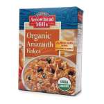


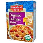


(Photo credits for all packaging: Arrowhead Mills/Hain Celestial)
As I wrote four years ago, there weren’t any glaring issues that needed to be resolved. That’s the case again today.
For support to my above points, perhaps that’s indicative of a solid refresh/renovation initiative.
The major 2017 changes include a new brand logo and front panel color to differentiate varieties. The back panel has a new role. Gone, apparently, are the stories and pictures about Arrowhead’s supply chain partners as well as the cross-selling photos of other breakfast products.
Another change is the addition of the product name on one of the side panels, helpful for quick identification in the home pantry (an opportunity pointed out in my 2013 analysis). There’s still no product id on the top or bottom panel to help flat pantry stocking, but maybe next time.
Harvey Chimoff is a versatile marketing and business team leader who believes good marketing sells. Contact him at StratGo Marketing, a plug-in marketing department resource for company leaders.

Leave a comment